
The magazine cover that I am going to analyse is a magazine called 'Kerrang', Kerrang is a music magazine that is fo people who like rock and heavy metal. However this magazine has a very striking image on the front of it. There are many features that can be commented on in this cover, these include the use of images, language and other features such as colour that are used.
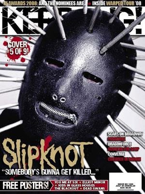
The image that is used on the cover of the magazine is a picture of a person wearing a mask with nails going inwards through the mask towards the persons head. When the you look at the magazine cover this image is the first thing that strikes you in the face. The image represents that the magazine is about heavy metal, death and is not for the faint hearted. This is similar to the masthead of the magazine, as the word 'Kerrang' has the effect that makes it look as though it has been shattered. This symbolises how loud the music is that the magazine is on about. Kerrang have purposely made the image stand out in front of some features that are on the cover. They have used layering by placing the image infront of the masthead and strapline, this shows that Kerrang have wanted you to see this image before anything else.
The colours that are used on the cover are all colours to dowith death, danger and voilence. The colours on the cover include black, grey, red and gold. The colours are all used in a way to make the image stand out from the rest of the cover. The word 'SLIPKNOT' which is written in gold, has a font which looks like dripping blood. This also relates to death, danger and violence.
Overall Kerrang have wanted to make the cover stand out from other covers. They have done this by using dull colours, not bright colours. The image is the main part of the magazine cover and the way that it stands out. When you have a first glance at the cover it strikes you as been disturbing and you almost think that something isnt right on the cover. But when you take a much deeper view at the cover it is very clever what Kerrang have done. They are using images that will attract their target audience by making the magazine seem wierd and dark.

No comments:
Post a Comment