Thursday, 22 October 2009

School Magazine Contents 1

I have kept my school magazine contents page very simple for the simple reason of it being a school magazines. The ways in which I have kept the contents simple is the colour scheme, language and fonts used.

For the contents page I have used two main colours which are blue and yellow. I have chosen these colours because they relate to the Biddulph High School logo. Everything that I have used on this contents page relates to the front cover of my magazine, and this is to give it some identification and so that you can recognise that they both come from the same magazine.

The images that i have used on my magazine have been scattered around the contents page to show which are the main stories in the magazine. I have put less important stories in the bottom right hand corner because I did not use an image for these.

School Magazine Cover 1

The image above shows an image of my school magazine cover. I have kept my cover very basic and can be refered to by looking at the contents page because of factors such as the colours used and the background used.

I decided to use a large image for my main story with smaller images at the bottom of the contents advertising smaller stories / less important. The Biddulph High School logo has been used in the top left hand corner of the cover and this helps show what the magazine is about. I have also decided to use layering on my cover by placing my main image infront of my magazines masthead, and this shows what my aim is and what I want people to glance at first when they look at the cover.

Thursday, 15 October 2009

Magazine Analysis Double Page Spread 3

Above is an image of a very basic double page spread that had been used inside a music magazine. I like the way that they have kept everything very basic in this spread. Such as the fonts, heading and image. However when some things are simple, they sometimes turn out better.

The text is by far the main bit of the double page spread, taking up three quarters of the page and only leaving a small one quarter for an image. Now normally this is the other way around and you would suddenly asume that it is going to be boring and unappealing to the eye. However, in this case the image actually makes the spread. The way in which the image takes up a full page behind the text and the way in which the image is just a natural photo, yet very clever. Yes the text has been layered in front of the image, but the background colour on the text boxes is similar to that of the image. They have done this on purpose so that the text blends in, and yet weirdly stands out at the same time. When you look at the double page spread further you realise that the only real part of the image that is showing, is that of the man leaning against the wall, and this shows that text has been really made to fit around the man, and not the man around the text. The way that they have used this techniques is very clever.

I like this double page spread because everything done in it is simple and this is the case when you look at how the two pages are linked together to make them seem as one. All the magazine has done to link the two pages together is to have an image the size of both pages, yet again this is simple, but effective. They also used the same text boxes on both of the pages meaning that this also makes them feel as one.

Magazine Analysis Double Page Spread 2

Above is an image that is of a double page spread from the popular indie magazine NME. This is one of my favourite double page spreads that I have researched so far. My favourite features on the spread are the colour scheme that has been used, the image that has been used and the heading that has been used.

The layout of the double page spread is very simple, yet very effective at the same time. NME have used a basic technique of using one half of the page for image and the other half of the page for text and information. The way in which they have made the spread effective is that they have linked the two pages together. They have done this by overlapping the heading onto both sides of the spread. This is a technique which is hard to spot, but once spotted you can see the effectiveness of it and how it makes everything seem to be on one page.

The first thing you notice when looking at the double page spread is the heading, which clearly says 'THE TEENAGERS' in a big bold font, when you have realised what the heading states your eyes then drift over towards the image that has been used on the left hand side of the spread and you then realise what NME have done. NME have put all of their features together and have made everything in the theme of teenagers. For example the colour scheme that has been used is either black or white text on a very bright blue background that is common. Hence the colours that have been used, you then realise that NME have also used a male theme. NME have used their colour very effectively by not using too much, or too little, but just putting small dotted amounts all around the page.

The image that have been used is very clever and represents typical teenagers. Because of where they have positioned the boys in the photo it shows the reader the idea of teenagers being laid back, lazy and chilled. The background in the image also represents a typical teenage boys bedroom with lots of posters on the wall behind them and the way that the three of them are lying down on the bed just looking plain cool. For any teenage boy who is reading the spread will be dreaming of being in the bands position and to have a lifestyle like them.

Magazine Analysis Double Page Spread 1

Above is an image of a double page spread from a magazine called Kerrang and there are many things to talk about when looking at the spread in more detail. The features that are interesting are the layout and where things have been placed, such as the images and text, the colour scheme that has been used and the language that has been used. When comparing these features i will find both the good and the bad points of the double page spread.

Kerrang is a magazine that contains lots of information about rock and heavy metal music, hence why most mastheads on Kerrang are edited to look as if they have been shattered by the sheer noise of the music they represent. The heavy metal music that is featured in Kerrang is also represented by the colours that are used in their double page spread. All of the colours that have been used on the spread go with the theme of the magazine because they are all dark colours such as black. The colour black represents heavy metal and rock music and then the text is written in the colour white which is veryy effective in two ways. One way because when you think of rock music, you think of the colours black and white complimenting each other, and a second reason is because the colour white stands out extremly well when on the background colour of black.


The layout of the double page spread is a very common technique that is used in many magazines, and is proven to catch the readers attention. The technique that has been used is that Kerrang have used two thirds of the page for an image, and a third of the page for text. This is a good technique to use because the reader does not want to sit there reading too much text, where as if there is a picture it is far more appealing to the eye and gets the reader more interested.

The images and language used relate to one another. The heading used that is layered in front of the image states, 'Hairy Fairy Tales' which shows that the magazine has a bit of a comedy side to it. But this heading relates to the image because in the image are people dressed up with long hair and beards. Together these two features show a really funny side to Kerrangs music magazine and they have to make them look like punk rockers.

Magazine Analysis Contents 5

Above is an image of a music magazines contents page known as Vibe. The contents page is unique in its own way because of many reasons. I will be looking into three of those reasons in more detail. Three features that I will be looking at are the image used, layout and colour scheme.

Firstly, the image used is very unconventional. It is unconventional because the women used in the image are doing a very male like pose. Another talking point about the image is how it dominates the whole page. Once again the text has been reduced to a small font and shoved to the side of the page. The pose that the women are striking shows what the rest of the magazine is about; hence club and dance music.
Secondly, from the layout you will notice that the page is dominated by the large image of the two women. The effect of this is that it makes it more appealing to the reader; hence making them enjoy their experience more when reading the magazine.
The final feature that I will be talking about is the colour scheme used. The colour scheme is a basic black text on white background look, this means that it is very easy for the reader to see what is written on the page. Another effect of this is that it gives the page an old school design. One more effect of having a white background is that it makes the image stand out clearly on the page. This makes the image seem, bright, colourful and almost 3-D.

Magazine Analysis Contents 4

Above is and image of another music magazine contents page that I will be analysing in order to create a good contents page myself. Unlike the other contents pages that I have analysed, this one uses the effect of using hardly any text at all and is mainly filled up by the use of images. The three main talking points on this contents page are images used, text used and the chosen layout.

The first feature used is the images. As you can clearly see the contents page is massly covered in images. This is due to the fact that images are far more appealing than just looking at text. However, the images serve a purpose because they contain page numbers on them. This shows that the magazine expects the reader to automatically know what the picture is showing and who it is in the picture. This effect is good because it makes the reader want to turn to the page number that the image is concerning and the main reason for this is because there is no information about the image on the contents page.

The second talking point is the text used and this relates to the images used because it is a complete contrast. It is a contrast because many images are used, where as hardly any text is used and when it is, it is in a very small font size. However, as I have stated before this has a good effect because the reader would much prefer to look at images rather than text.
The final talking point is the layout of the contents page. The layout is also a very good feature used and fits in well with the use.

Monday, 12 October 2009

Magazine Analysis Contents 3

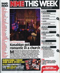
The image above is a picture of a contents page from an NME magazine. The main features which make this contents so page interesting is the colour scheme, layout and language and layout used.

The colour scheme used on the contents page contains the three main colours used on all of NME's magazines, and those colours are red, yellow and white. On their contents page NME have used lots of red and black text with white in the background meaning the the texts stands out clearly. This means that the reader will be able see what is in that issue of the magazine, hence making it more appealing.

NME have also placed their logo (NME) in the top left hand corner, ehich is the same as where it is placed on their front cover. This means that people can relate to NME's magazine and recognise it. At the bottom of the contents page NME have placed an advertisement about subscribing to their magazine. This advertisement is written in a bold yellow font meaning that it stands out. NME have wanted this advertisement to stand out on purpose because they want people to subscribe to their magazine, and hence they will make more money. People will spot this in the corner of their eye because it has been written in a different colour from the rest of the page.

The language used on the contents page makes is effective as it makes the reader want to read into the magazine more. Heading are used such as, 'Kasabian get romantic in a church'. This heading is very wierd and is out of the ordinary and this makes the reader more interested. NME is a magazine that is different and out of ordinary, and this heading can relate to that.

Thursday, 8 October 2009

Magazine Analysis Contents 2

The image above is a picture of a contents page from a magazine called 'Drummer'. The main features on the contents page are the colour, layout and used images. All of these features have their positives and negatives which will decipher whether or not the contents page is good or not.

The three main colours used on the contents page of the magazine are, black, red and white. White is mainly used as a background colour to compliment the other colours and to help them stand out more. Red is the probably the main colour used on the magazine cover, and it is also the brightest. The colour red represents many things such as, danger and love. But for this magazine the colour red represents excitement, and by doing this, Drummer have made the reader want to read into the magazine further.

The layout of the contents page has been well thought through, with about two thirds used for images and about one third used for text. The colour of the images is mainly black with some red complimenting it. Most of the text used is in the colour black with the masthead in bold. This makes the mashead stand out and shows that they want people to know what their magazine is called. Another featue which shows that they are trying to make their masthead stand out and be known, is that the use of layering is not used over the masthead.

Monday, 5 October 2009

Magazine Analysis Contents 1

The contents page in a magazine shows the reader everything that is in the magazine by showing them little previews about everything. The image above shows Kerrang's contents page and how it is set out. Kerrang shows the more important story's in pictures and they just use text to describe the less important important stories/features that are in the magazine. On the left of the magazine contents page there is a picture that is larger than the rest of the pictures, this is probably because this image is for the main story in the magazine contents page.

Kerrang promotes heavy rock music and they show this by the colours that they use on their contents page. Kerrang have used two main colours on their contents page, which are black and yellow; contrasting colours. When these two colours are mixed together they symbolise dark, evil and excitement, and this attracts people to buy the magazine. Kerrang have used the colours black and yellow evenly making the contents more attractive and appealing.

Another way in which the magazine contents looks dark is the images. All of the images on the page look dark and most of the people in the images are wearing dark colours, such as black and dark grey. All of these things and layout attract the magazines target audience and makes them want to read the magazine. Kerrang has been very clever in the way that they have layed everything out on their contents page by using pictures for content, e.g. using a big picture for the main story and scattering little pictures around the big picture to represent other stories.