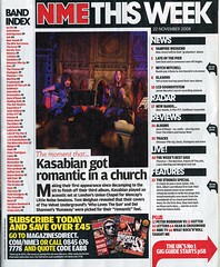
 The image above is a picture of a contents page from an NME magazine. The main features which make this contents so page interesting is the colour scheme, layout and language and layout used.
The colour scheme used on the contents page contains the three main colours used on all of NME's magazines, and those colours are red, yellow and white. On their contents page NME have used lots of red and black text with white in the background meaning the the texts stands out clearly. This means that the reader will be able see what is in that issue of the magazine, hence making it more appealing.
NME have also placed their logo (NME) in the top left hand corner, ehich is the same as where it is placed on their front cover. This means that people can relate to NME's magazine and recognise it. At the bottom of the contents page NME have placed an advertisement about subscribing to their magazine. This advertisement is written in a bold yellow font meaning that it stands out. NME have wanted this advertisement to stand out on purpose because they want people to subscribe to their magazine, and hence they will make more money. People will spot this in the corner of their eye because it has been written in a different colour from the rest of the page.
The language used on the contents page makes is effective as it makes the reader want to read into the magazine more. Heading are used such as, 'Kasabian get romantic in a church'. This heading is very wierd and is out of the ordinary and this makes the reader more interested. NME is a magazine that is different and out of ordinary, and this heading can relate to that.

No comments:
Post a Comment